Introduction
The first global user conference for Next.js was held during the last week of October 2020. And the biggest highlight of the conference was the newly launched Image Component with Next.js 10 release.
Key points from the Next.js 10 release:
- The Image Component
- Automatic Image Optimization
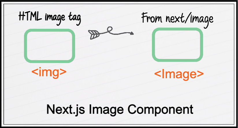
As the new next/image component has been introduced as a replacement for the img tag bringing in many powerful capabilities.

The team at Next.js explained the value of optimizing the images as:
|
“Images take up 50% of the total bytes on web pages. Images have a big impact on the Largest Contentful Paint as they’re often the largest visible element when a page is loaded. Largest Contentful Paint is a Core Web Vital that Google will be using in their search ranking very soon. Half of all images are over one megabyte in size, […] Sites load a 2,000 by 2,000-pixel image, but phones are only displaying it as 100 by 100 pixels. […]30% of images on web pages are outside of the initial viewport, […]99.7% of images on websites don’t use modern image formats like WebP. In order to use images on web pages in a performant way, a lot of aspects have to be considered: size, weight, lazy loading, and modern image formats” - (Source: Next.js) |
What's new?
Next.js 10 adds a built-in <Image> component to be used as a drop-in replacement for the HTML <img> element.

The following code in HTML:
<img src="/image-component.jpg" width="1200" height="800" alt="Image Component">
would be replaced with this:
import Image from 'next/image'
<Image src="/image-component.jpg" width="1200" height="800" alt="Image Component">
By implementing best practices, the new Image component seeks to improve page performance by ratio-based image, layout placeholders, lazy loading, responsiveness, and optimization of image formats.
Five common image performance issues
The five most common issues faced by developers while using images in their websites are:
Improperly-Sized Images
Unnecessarily large-sized images waste the user data and make the website slow down.
Image Formats
Older formats like JPEG and PNG are larger and don't offer compression, whereas modern image formats like WebP and AVIF offer compression and are at least 20-30% smaller in size.
Loading images
Generally, if the single page application is too long and there are many images to load, it becomes unnecessary to load all the images as it takes a lot of data, and most of the users don’t even scroll till the bottom.
Image Preloads
Suppose a developer wants to load an important image early and make that the first visual item for the user, usually the developer has to add preload to each critical image. The next/image component helps by giving a simple “priority” attribute, which automatically adds the preload to the image.
Unsized Images
Usually, the image width and height are not set, but it’s essential as they are used to calculate an image’s intrinsic aspect ratio. If they’re not set, the page shifts around, and that results in a bad experience for the user, and in fact, it’s one of the vital web metrics.
In each case, the Image Component either takes care of the issue or gives you the new tools to tackle it yourself.
Why should you choose the next/image component?
First and foremost, the Image component is groundbreaking, and it's going to help a lot of developers and organizations to build performant websites with massively improved user experience by implementing the best practices of web development.
Let’s see how:
Handles automatic lazy-loading
It helps to delay the requests to the images and only loads them in the situation when they’re needed or when the images reach a determined distance from the viewport.
Preloading of critical images
With the use of the priority prop, the image component loads the image faster by using link rel="preload" automatically.
Correct sizing across devices
Through built-in Image Optimization, the Image component generates smaller sizes automatically.
Automatically serves the image in modern formats like WebP
The Image component automatically optimizes the images in modern image formats like WebP and reduces the size around 30% less than JPEG.
Improved page performance
The page performance does visibly improve a lot more, and the performance gets higher and more efficient.
Faster UX
The user experience of the website improves because the image component provides better and performant functionality.
Implementing the next/image in your project
We are going to implement a simple example of the Image component and its layout types here.
Layout types
It is possible to use four different types of layout values (the default value is intrinsic):
- Fixed: The image dimensions will remain fixed on all viewports(that means no responsiveness).
- Intrinsic: For smaller viewports, the image may scale down the dimensions but retain the original dimensions for larger viewports.
- Responsive: The image automatically scales down/up the dimensions for smaller/larger viewports.
- Fill: The image fills according to the width and size of the parent container/element.
Implementation of the Image component with different layouts:
Comparison of image size between Image component vs. img tag
Imagine you have 100 images on your app's landing page, with each image 8Mb in size. Do you think that it’s necessary to load around 800 MB of image files every time someone visits your website’s landing page? It does not, and it’s going to slow down the website and performance.
Just from the example given above in the sandbox, the below image depicts the size and the type of img tag.

Images served using the img tag
The four images are around 6MB and in the .jpg format.
That’s why most of the images on the web are served in the most modern forms, such as the WebP format. The WebP format trims down the size of the image, and you can feel no difference in the quality of the image.
So, the question arises, do we need to change the format of every image manually? No, you don't need to do it manually; otherwise, it would be so burdensome. This is where Next.js 10 comes in with the built-in support for Image Optimization using the next/image component.

Images served using the Image component
The images are now in WebP format, and their sizes have been reduced drastically.
We can say that using the Next.js Image component is quite more effective than the normal img tag, and we can achieve this all by using the Image component in our codebase.
Lazy loading
Lazy loading has also been applied to images by the Next.js Image component. If you are unfamiliar with it, here is an example given to illustrate how and why you can use lazy loading.
Is it appropriate to load all the images whenever someone visits your website, even though the images are now in WebP format? And if the user comes and leaves without scrolling, does loading the pictures at the bottom of the page make sense?
There isn’t any need to load images that the user will not encounter in most of the scenarios.
And that’s when Lazy Loading comes in as our savior, as it helps to delay the requests to the images and only loads them in the situation when they’re needed or when the images come into the view of the viewport/screen. This helps reduce the initial size of the page and improves/increases the website's performance.
Have a look at the implementation of lazy loading of the example:
We can also see on the developer console on the right side that once we arrive at the viewport of the images, the image requests appear accordingly.
You can already see the beneficial advantages the Image component provides us.
Conclusion
With the introduction of the Image component in the Next.JS 10 conf and all the powerful capabilities it provides, it's tremendously going to improve the website performance and serve the images in the most optimized way. And the best thing about this component is that it will play a significant role in improving websites' user experience.

Waris Anwar, Frontend Engineer - L1
Waris is an ambivert Künefe lover who has the ability to meet cool people and celebrities. When not at work, you will find him seeking discomfort by adventuring, exploring nature photography, and listening to people's crazy anecdotes around the world.


 We respect your privacy. Your information is safe.


