 We respect your privacy. Your information is safe.
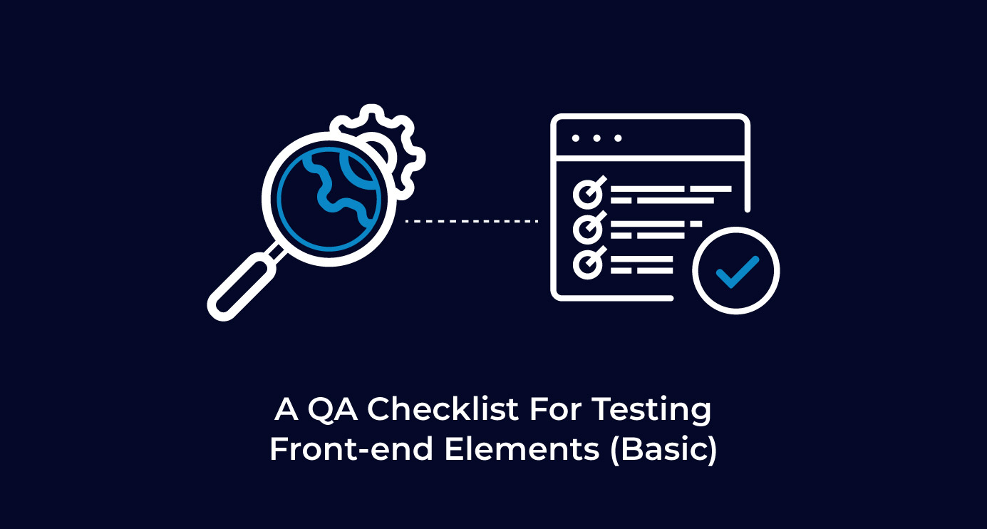
1. What is the GUI?
Graphical User Interface (GUI) or “gooey” defines a graphical interface between a user and the system to facilitate interaction, i.e. what the user sees to interact with the application. When the user opens a website, say https://www.axelerant.com/, the user sees the user interface with the help of which he/she can interact with the website. This GUI includes the screen layout, styling of buttons, text boxes, font styles, font sizes, validation messages, images, etc.
2. The need for frontend testing
Most users first observe the design or the look and feel of the website. A good UI design will guide users on how to interact with the site in a clear and intuitive way, even if it's their first visit. If the UI design is poor, it could make users feel the website is complicated and difficult to operate. This could lead to a sense of confusion and frustration and users leaving the website, which could further lead to business losses. That is why GUI testing is important, so that website is bug free and users have a good UI experience.
3. How to test elements on the frontend
3.1 Common test scenarios for elements
a. Mandatory Fields
Verify mandatory Signs (*) wherever applicable. This could be applicable for labels, text boxes, dropdowns, list items, radio buttons, etc. Refer to the examples in Figure 1 and Figure 2.

Figure 1. Mandatory Field - TextBox (Image source)

Figure 2. Mandatory Field - Label and TextBox
b. Font and Color
- Verify that the font family, font style, font weight and font color of elements (labels, headings, button text, dropdown lists, etc) meet customer requirements. Refer to the examples in Figure 3.

Figure 3. Font and color
- Verify that the background colour of the elements (buttons, page, popups, etc) meets customer requirements. Refer the examples in Figure 4

Figure 4. Background color
c. Padding
On a page/form/popup, ensure that the padding is uniform (left, right, top and bottom) to maintain consistency. It should be tested via developers tool. Refer to the examples in Figure 5.

Figure 5. Padding
d. Alignment
- Verify that elements such as headings, labels, text on buttons, tables, pagination, etc. are properly aligned in the application with regard to each other. Refer to the examples in Figure 6.

Figure 6. Elements alignment (Image source)
- Verify that the logos are left aligned in the header. Users scan pages starting from the top left corner, going left to right down the page. This means users will spend more time viewing a left aligned logo than a centered or right aligned one.
Also, verify that the logo and the rest of the elements on the left side of the page are aligned to one invisible line, and the same should apply to the right side of the page.
Refer to the examples in Figure 7.

Figure 7. Alignment
- Verify that the alignment of the text (left, right, center or justified) is according to requirements. Refer to Figure 8 for examples.

Figure 8. Text alignment
e. Spacing
- Check all the GUI elements, e.g. text boxes, checkboxes, labels, headings, etc, for size, position, width, length and clear separation of different sections on the screen.
- Spacing should be tested for each element separately and also for each element with respect to the other elements on the page.
- There should be consistent space between the different elements. Refer to the examples in Figure 9.

Figure 9. Spacing
f. Consistency
The screen’s look, feel and design should match the other screens in your application. Using a style guide is a great way to ensure consistency throughout your application.
Refer to the examples below:
Example 1: If we have multiple sections on a page, the headings for multiple sections should have same font style, family, color, weight and size. Refer to figure 10 for an example of inconsistency in the fonts of each section.

Figure 10. Inconsistency in the font sizes and styles (Image source)
Example 2: It’s good to have consistent sizes for images on a page. Refer to Figure 11 for an example of inconsistent size of image on a page.

Figure 11: Inconsistency in size of image (Image source)
3.2 Test scenarios to the specific elements
a. Text Boxes
- Verify the input placeholder.
- Verify whether it's an editable/non-editable text box.
- Verify help text below the text box wherever applicable.
Refer to the examples in Figure 12.

Figure 12. Textboxes (Image source)
b. Labels
- Verify the case of the label, i.e. uppercase or lower case.
- Verify that the mouse pointer is not a hand icon. Refer to the examples in Figure 13

Figure 13. Labels
c. Buttons
- Verify the border and border radius for buttons.
- Verify that the text on the button is lowercase or uppercase.
- Verify that the mouse pointer is a hand icon whenever a value is clickable. Refer to the examples in Figure 14 and 15.

Figure 14. Button

Figure 15. Button dev tools
d. Dropdown
- Verify the placeholder.
- Verify the icon of the dropdown changes when the dropdown is expanded and collapsed.
- Verify that the already selected value is highlighted in a separate color when the dropdown is expanded.
- Verify that the mouse pointer is a hand icon whenever a value is clickable.
Refer to the examples in Figure 16 and 17.

Figure 16: Corrected dropdown (Image source)

Figure 17: Corrected dropdown (Image source)
e. Header and Footer
- Verify that the header and footer are consistent throughout the website in terms of content, spacing, padding, height, width, length, etc.
- Header and footer should be aligned with each other and also aligned with different elements on the page.
Refer to the examples in Figure 18 and 19.

Figure 18: Wrong alignment of header and footer with regard to each other. (Image source)

Figure 19: Correct alignment of header and footer
f. Checkboxes
- Verify that checkboxes are designed as per the website theme.
- Verify that the user is able to check/uncheck multiple checkboxes.
Refer to the examples in Figure 20.

Figure 20. Checkboxes (Image source)
g. Radio Buttons
- Verify that radio buttons are designed as per the website theme.
- Verify that the user is able to select only one radio button.
- Verify that the mouse pointer is a hand icon whenever a value is clickable. Refer to the examples in Figure 21.

Figure 21. Radio buttons (Image source)
h. Validation
- Verify that validation messages are designed as per the application’s theme.
- Verify the colors for the validation messages i.e. success, warning, error and information messages.
- Verify that messages are removed on performing any action like clicking a button or any event trigger.
Refer to the examples in Figure 22, 23, 24 and 25.

Figure 22. Error messages (Image source)

Figure 23. Success message (Image source)

Figure 24. Warning message (Image source)

Figure 25. Information message (Image source)
3.3 Forced element states of UI components
There are many types of states of UI components. Some of them are as follows:
a. Hover
This state indicates that the cursor of the pointing device (mouse) is currently placed on the GUI element. This could be applicable to elements like hyperlinks, buttons, etc.
- Verify the font family, font color, font style and font weight on hover.
- Verify the background color on hover.
- Verify the action.
- Verify the tool tip (if applicable).
Refer for examples to Figure 26, 27 and 28.

Figure 26. Before hover

Figure 27. After hover

Figure 28. Dev tools for hover
b. Active
Active state indicates which item from a set of options is being viewed. Elements that activated state are to are toggle buttons, bottom navigation menu, tab items, etc.
- Verify the line element as activated state signifier.
- Verify the overlay as activated state signifier.
Refer for examples to Figure 29 and 30.

Figure 29. Overlay (Image source)

Figure 30. Line element as activated state signifier (Image source)
c. Focus
A focus state indicates when a user has selected an element using a mouse/keyboard. This can be applied to buttons, cards, list items, text fields, etc.
Verify the changes in color or area highlighted.
Refer for examples to Figure 31 and 32.

Figure 31. Focused state

Figure 32. Without focus
d. Focus Within
This selector is useful when we have to highlight an entire <form> container when the user focuses on one of its <input> fields.
Verify the changes in color or area highlighted.
Refer for examples to Figure 33, 34 and 35.

Figure 33. Without focus within class (Image source)

Figure 34. Focus within (Image source)

Figure 35. Dev tools for focus within (Image source)
e. Visited
The visited state represents links that the user has already visited once.
Refer for examples to Figure 36 and 37.

Figure 36. Before visit (Image source)

Figure 37. After visit (Image source)

Shefali Arya, QA Engineer - L2
International culinary enthusiast with wanderlust—and by wanderlust she means she wants to see the whole world.
-2.png)


Leave us a comment