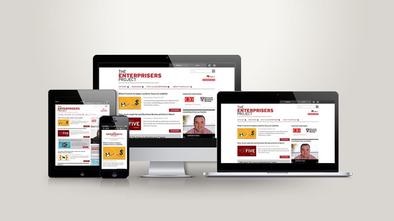
Time Critical Responsiveness For Red Hat
November 6, 2018

Objective
Challenges
The need to craft a user experience for maximum usability on a tight schedule and with consideration of high performance on mobile devices.
Solution
The website was built on Drupal 7 with extensive use of Panels and Views modules. We began the development by breaking down the mockups and identifying repeating patterns. Further, following a UNIX philosophy, we further broke these individual components into separate partials that plugged together to build a scalable library of patterns. We used Sass via Compass and hosted the code on a Git repository to ensure a quick and flexible workflow throughout the production process. We setup Grunt to help us in minifying the stylesheets, auto-prefixing CSS3 properties based upon the CanIUse API, concatenating JavaScript, and optimizing images. Font-icons helped reduce the number of server requests and display crisper content on devices with HiDPI screens.
Result
We were able to deliver an easily configurable homepage for The Enterprisers Project that performs effectively on