 We respect your privacy. Your information is safe.
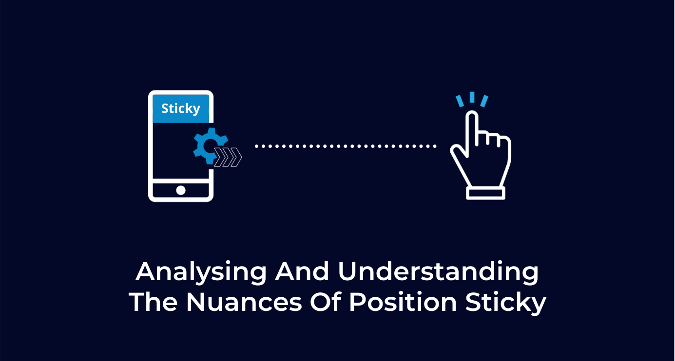
Introduction
It has been some time now since CSS position: sticky has been around. However, browser support was not that great for a while. As of today, except for Internet Explorer 11, all major browsers support position sticky without any major issues. It is worth taking a look to understand what is position sticky, how it works, and some of the nuances we need to consider.
Why position: sticky?
CSS has position fixed when we want to ensure something sticks to a position of the page irrespective of the page scroll.

This has been straightforward & without any issues. The real challenge has been doing something like this:

As you can see in this mockup, we want to keep the element “sticky” at the top of our browser window only when it reaches the edge. If the user scrolls past that position on the page, the element shall be “sticky”. Upon scrolling in the opposite direction, the element shall again reclaim its place on the page and become “unsticky”.
Challenges in traditional methods
- There has never been a CSS only solution.
- We need a window scroll event to keep track of the element’s position offsets relative to the viewport scroll position to toggle its position property.
- Such Javascript often creates performance issues on lower-end devices, as we need to keep track of offsets of the element with respect to the window by using some sort of window scroll event handler.
Enter position: sticky
As you can see, the code used to make sticky work is very similar to fixed. I created an interactive example to play with:
Things to consider when using position sticky:
- Unlike fixed, sticky position comes with no defaults. So we always need a top, left, bottom, right to make it work. Position sticky on its own does nothing.
- Position sticky works in both vertical and horizontal directions.
- Position sticky is designed to be sticky inside a container, which means your overflowing/scrolling container needs to be a parent of the sticky element.
- Unlike fixed, which is a viewport level property, sticky works relative to the boundaries of the parent.
- Parents cannot have overflow: hidden on them, especially for the direction you want to make sticky work.
Detecting position sticky
Now that we have seen how position sticky works, let’s also address the question, “What if I want to style my element differently when it is sticky?” For example, it is a common design pattern to use shadows on sticky elements and show them elevated from the main page.
As of now, there is no native way that allows us to detect position sticky’s toggle from fixed to a relative.
But we can use a straightforward trick with an Intersection Observer to solve this problem. We add 1px tracker elements in the direction of our desired sticky edge. If our element is sticky to the top, we add it before our element. If our element is sticky at the bottom, we add the tracker below the element so we can watch for the bottom edge.

Here, I used the same approach to detect when my sticky element moves away from its bottom position and becomes unsticky.
Conclusion
As we have seen in this blog, using the position sticky is very similar to fixed. It does involve some considerations for the markup of the element and its position relative to the parent. We also showcased how to style sticky elements differently upon position change. I hope this blog encourages you to use position sticky more often in your work.

Swarad Mokal, Technical Program Manager
Big time Manchester United fan, avid gamer, web series binge watcher, and handy auto mechanic.


Leave us a comment