 We respect your privacy. Your information is safe.
Introduction
When the healthcare.gov website launched in 2013, it was a complete disaster due to several reasons.
- Initially, users had to register for an account before shopping for plans. This was a fundamental UX design flaw, causing frustration among customers.
- 250,000 users, five times the expected amount, tried to use the website. This caused the website to crash within two hours.
- The website's ability to work with other sites, like the Internal Revenue Service website or the Department of Veterans Affairs site, made things worse.
Ultimately, the site was taken down during the first weekend. These sort of issues are often rooted in design debt.
Design debt involves quick design choices, compromising user experience to expedite product release. This, along with hasty coding decisions, can lead to failed product launches.
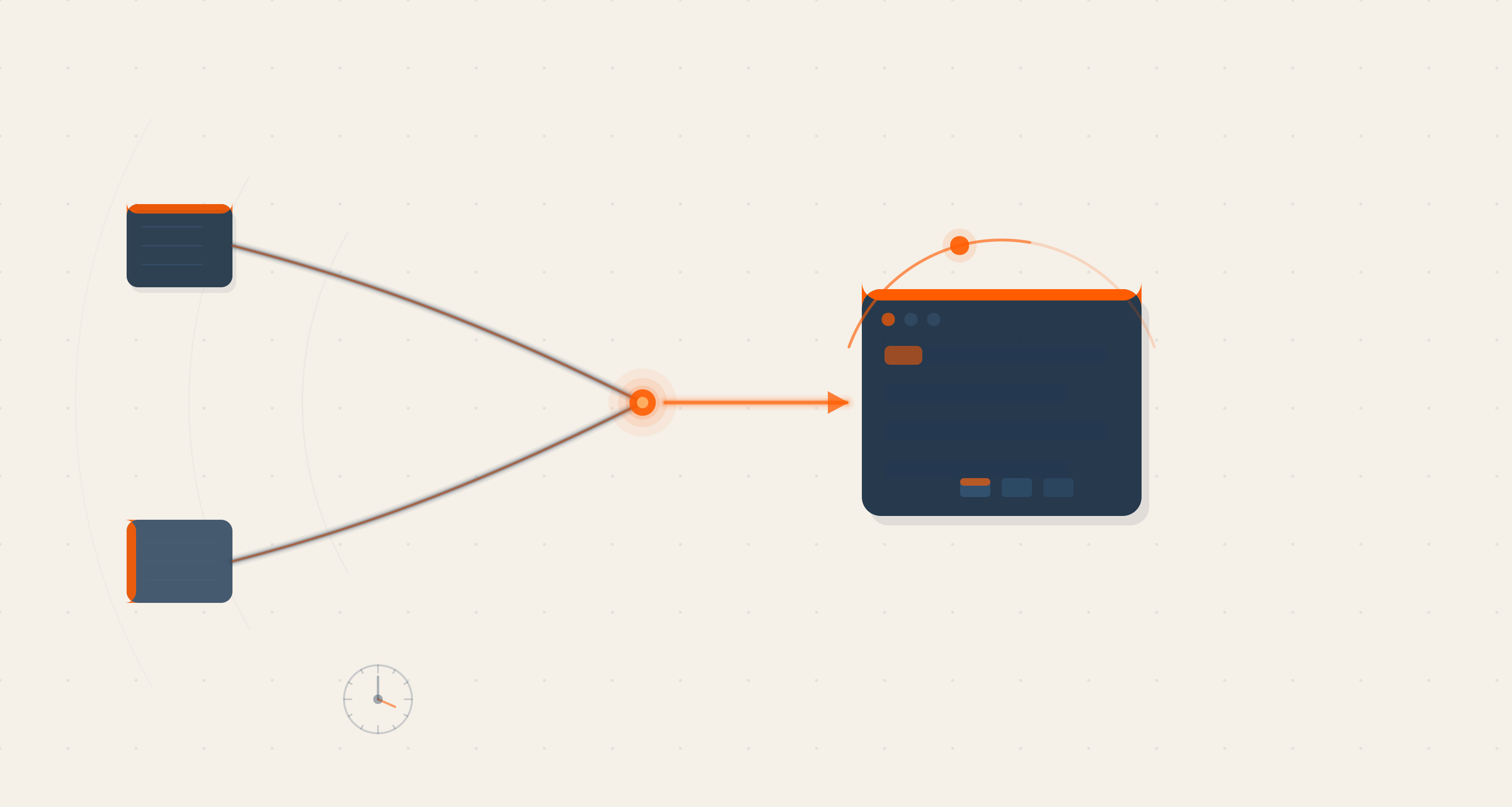
Implementing a design system helps solve these issues and ensures efficient digital product delivery.
What Is A Design System?
A design system is a collection of reusable components with clear standards that guide teams while creating digital products. It streamlines workflows, maintains consistency, and offers a cohesive user experience.
A design system is the single source of truth which groups all the elements that will allow the teams to design, realize and develop a product.
~ Audrey Hacq, Design System Advocate
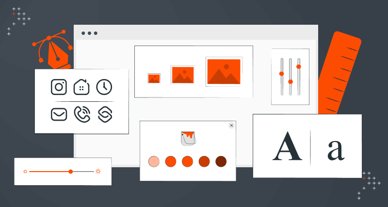
A basic design system consists of components:
|
Design System Components |
|
|
Style Guides |
Style guides establish consistent visual and brand guidelines, including typography, color palettes, and iconography. These guides reduce errors and revisions by providing a standard reference, saving time during product development. |
|
|
|
|
Component Libraries |
Component libraries contain reusable UI elements like buttons, forms, and navigation bars. These simplify the development of the digital product, enhance consistency, and accelerate the creation of the user interface. |
|
|
|
|
Design Principles |
Design principles accelerate development cycles by reducing iterations. This results in a more focused and efficient design process. |
|
|
|
|
Pattern Libraries |
Pattern libraries are curated sets of reusable UI elements and design patterns. These promote consistency and efficiency in design and development, ensuring timely delivery. |
|
|
|
|
Documentation |
Guides and references help teams use and maintain the design system. This clear guidance minimizes errors and boosts development efficiency, leading to faster product delivery. |
|
|
|
|
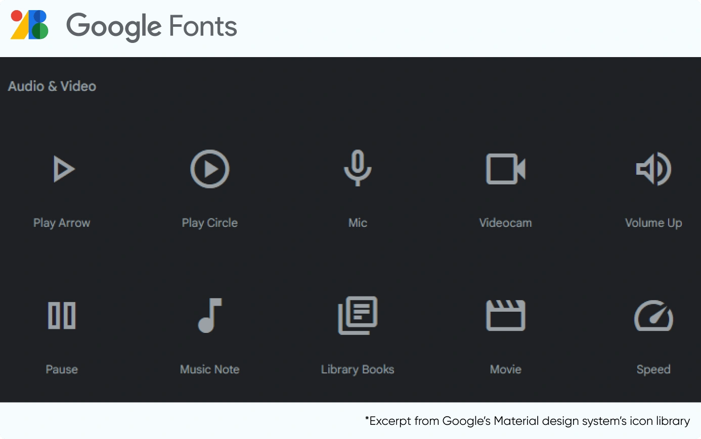
Icon Library |
Icon libraries provide standardized graphics that help simplify and accelerate the design and development process. |
|
|
|
|
UI Kits |
UI kits are pre-designed sets of UI elements, which help maintain a unified look and feel of a product. Designers and developers can select and incorporate these icons, saving time and effort in creating them from scratch. |
|
|
|
|
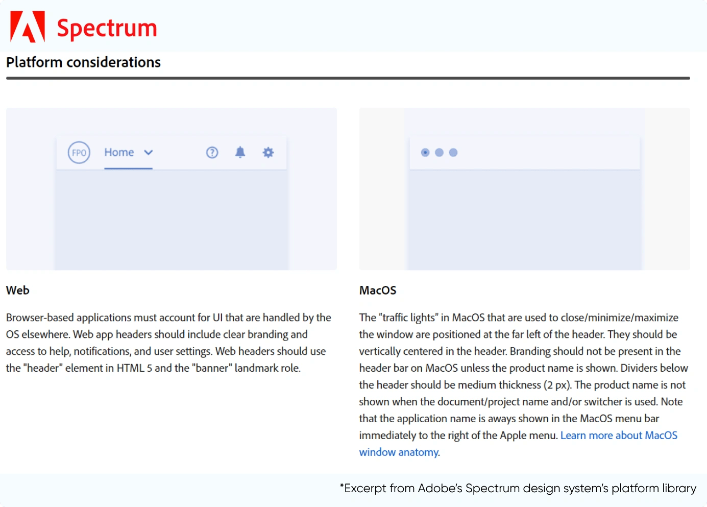
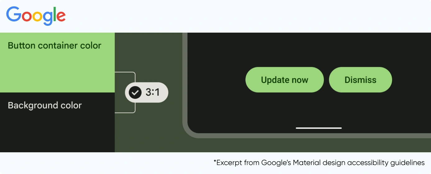
Accessibility Guidelines |
Accessibility guidelines provide a framework for maintaining inclusivity across interfaces. These guidelines include screen reader compatibility, keyboard navigation, and alternatives for non-text content. |
|
|
|
|
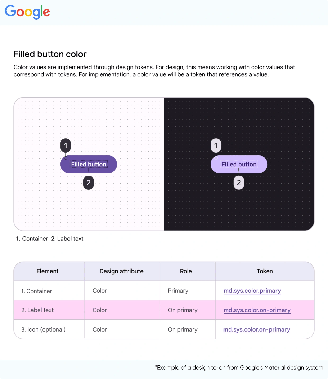
Design Tokens |
Design tokens store design decisions like colors and typography in a reusable and consistent format. They serve as a common language between designers and developers. |
|
|
|
|
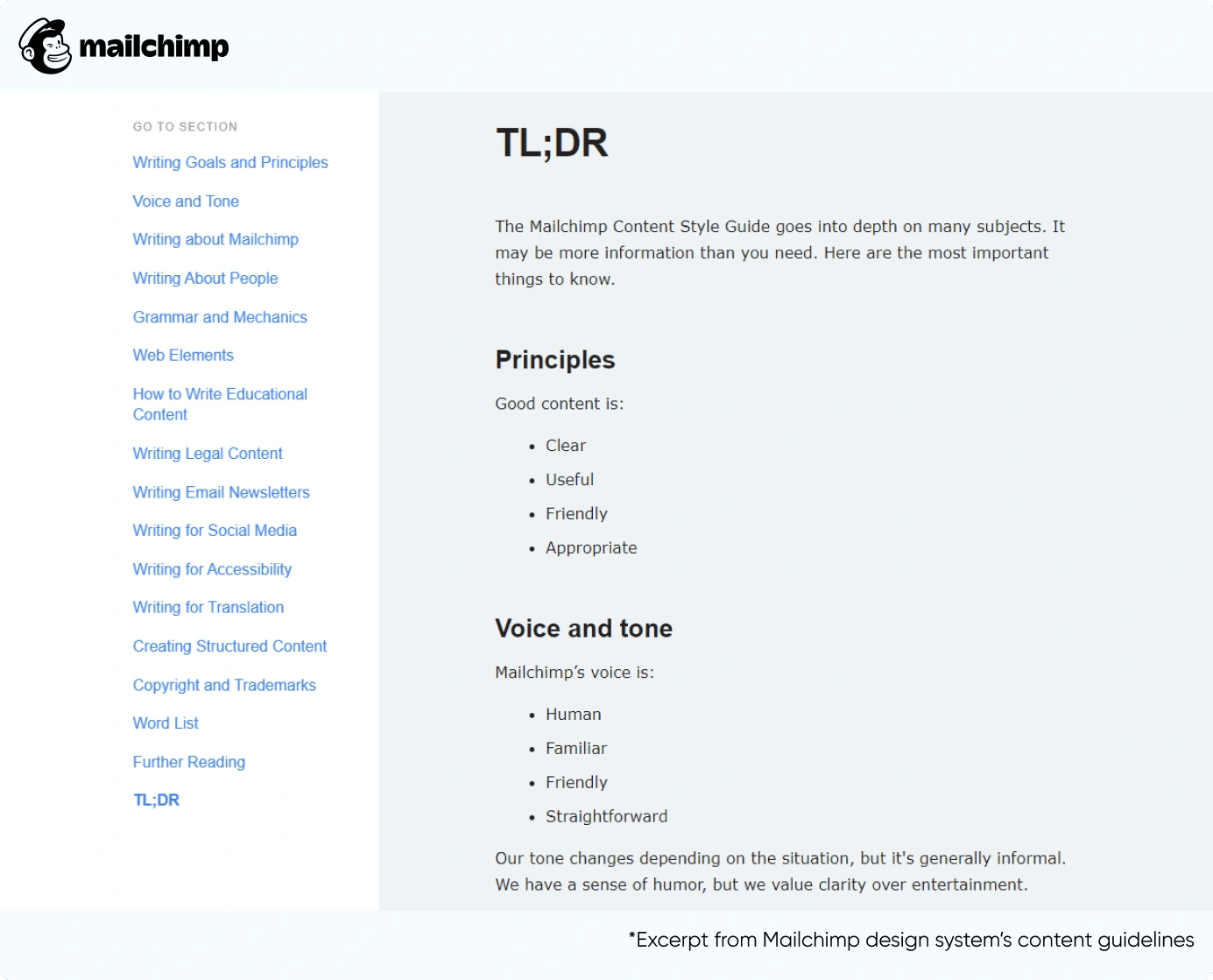
Content Guidelines |
Content guidelines include rules and recommendations for producing and managing text, images, and multimedia content. The guidelines help maintain brand consistency, tone, and quality across all written and visual materials. |
|
|
|
How Do Design Systems Help Businesses
A design system offers a structured approach to fixing critical business problems.
|
Business Challenges |
Benefits Of Implementing Design Systems |
|
Teams Working In Silos |
Teams working in silos often tend to work on similar components and solve the same design problems. This situation results in the duplication of assets and chaos. By implementing design systems, designers and developers can align better and collaborate for faster product delivery. |
|
New Team Member Onboarding |
New team members are easier to onboard on a project with a design system. It enables them to contribute more quickly to the design and development process. According to an experiment by Figma, with relevant design systems, designers are 34% more productive. |
|
High Resource Costs |
Organizations tend to shy away from a design system as they don’t see the long-term benefits of implementing it. Contrary to this, design systems help organizations optimize resources, leading to a higher ROI and faster product delivery. |
|
Maintain Relevance |
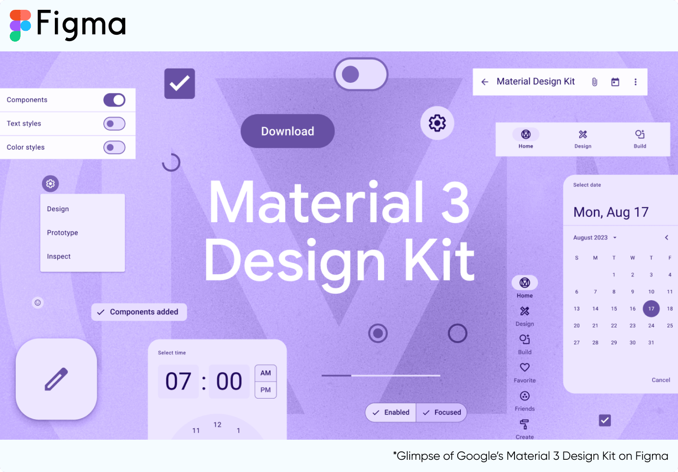
Design systems need to evolve continuously. By using up-to-date design systems, organizations can launch market-relevant products with minimal iterations. Google's Material Design and Apple's Human Interface Guidelines are two dynamic design systems prioritizing user-centered experiences. These systems offer extensive resources and guidance for teams. |
Vital Considerations For Implementing A Design System In Your Organization
Visual design systems are based on a brand’s objectives. Regardless of the organization’s size, these offer a range of universal benefits. It’s critical to customize the design system to align with a brand's unique needs and scale.
Here are some vital considerations for implementing a design system in your organization:
Establish Visual Branding
Ideally, you should ensure your product's visual branding is in place. For this, you need to make definitive decisions with your core team. Commit to your choice for at least a few years, which helps establish stability and consistency.
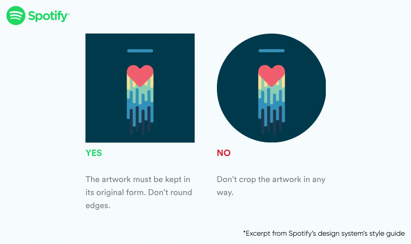
Spotify's visual branding centers on vibrant green showcased in a distinctive circular logo. While Spotify has subtly adjusted its visual branding over the years to stay current with design trends, core elements like the green color and circular logo have remained consistent.
If your organization's visual branding is still in progress, finalize it before developing any content library or comprehensive design system.
Evaluate Tech Stack And Platforms
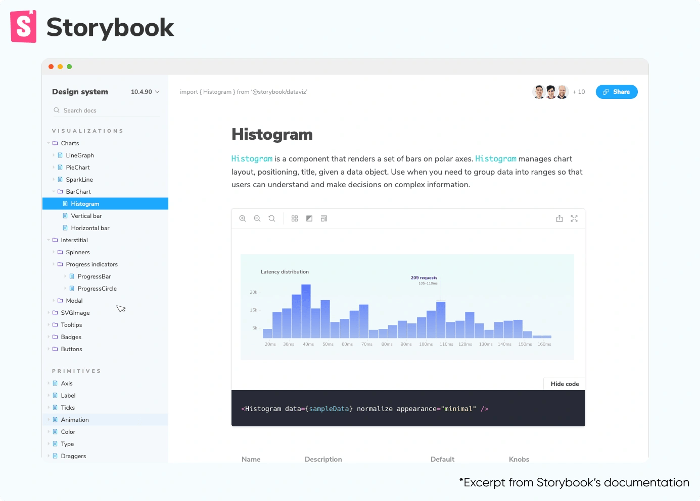
If you have the visual branding established, assess the brand's tech stack and check its compatibility with the design system. If that is not an immediate option, consider starting with a small yet scalable content library.
Ready-to-use platforms like Storybook are great if you want to opt for a plug-and-play structure. Use them for building content libraries, which eventually expand into a complete design system.
Opt For Custom Design Systems
Organizations with a mature digital product and well-defined brand vision should go for customized design systems. The systems should draw inspiration from the brand's existing digital assets and guidelines, if any.
IBM's Carbon design system was instrumental in designing and developing a new self-service purchase experience on IBM.com. After the transition, over 50% of customers started converting, which was a large increase in orders and revenue.
Consider Creating A Custom Typeface
You can also opt for a custom typeface to leverage your existing design system. Changing the typeface across your digital product is a rebranding process. It is an idea worth exploring if you’re aiming to enhance brand recognition.
Airbnb’s custom typeface Cereal helps establish a distinct and cohesive visual language for the brand. Brands like Netflix, General Electric, Intel, and Coca-Cola also have custom typefaces across their products.
How Axelerant Contributed To Red Hat’s Developer Portal’s Design System
For over eight years, Axelerant has been a trusted partner in delivering technology and design services to Red Hat. In a collaborative effort, Axelerant’s experts played a crucial role in enhancing the effectiveness of the brand’s existing design system by:
Resolving Typography Inconsistencies
Axelerant’s experts helped resolve font size inconsistencies in adopting the design system by renaming typography and defining when and where they could be used.
Extending The Design System
Red Hat’s web guidelines were well-defined, but there were no specific directives for mobile interfaces. The team needed to create mobile-responsive states missing from the existing design system. Mobile responsive UI components were added as a solution to this.
Introduction Of Tiles UI Components
Red Hat’s content types, including blogs, cheat sheets, ebooks, interactive tutorials, and events, were presented in irregular box sizes on the portal. To address this issue, consistent tile components with standardized dimensions were implemented. The content was reorganized within these tiles to establish a higher level of uniformity throughout the platform.
This new and improved design system in place will help the brand accelerate product delivery.
At Axelerant, we help organizations create new or leverage existing design systems to streamline digital product delivery. Schedule a call with our experts to learn more.

Dheeraj Khindri, Director of Experience Design
A pragmatic soul and cinema enthusiast who enjoys larger-than-life films—that’s Dheeraj. In his free time, he explores all things poetry, solo guitar sessions, and binge-worthy web series. His life’s essential values? Empathy, autonomy, and pragmatism.

-2.png)

Leave us a comment