
 We respect your privacy. Your information is safe.
Most organizations running multiple brand properties face the same trap: build brand one, rebuild most of it for brand two, repeat for brand three. A reusable component library built on Drupal Site Studio breaks this cycle by serving multiple brand properties from a single governed architectural foundation. Three brands, three codebases, and three independent maintenance backlogs is the default — and it is also the most expensive path available.
A global sports entertainment company operating at least three distinct event properties faced this situation. One brand was a flagship endurance sports series. Another was a music-themed running experience. A third was an epic adventure series. Each carried a distinct visual identity, audience, and content strategy. All of them needed common UI patterns: Hero Banners, Content Cards, CTA buttons, sliders, and video components.
The team chose to build a shared, reusable component library on Drupal Site Studio designed to serve all three brands from a single architectural foundation while allowing brand-level customizations.
This post examines the approach, the reasoning behind key decisions, and a framework for technical leaders evaluating the same architectural choice. A note on transparency: this engagement is ongoing, and quantified outcomes (development time savings, component reuse ratios, editor efficiency metrics) are not yet available. The value of this post is in the architectural reasoning and the decision framework, not in proven results.
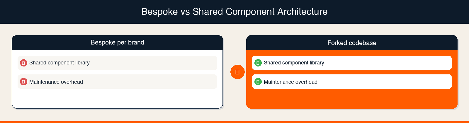
Most multi-brand organizations do not consciously decide to build bespoke per brand. They drift into it. Brand one launches on a timeline. Nobody thinks about brand two during that build. When brand two arrives, the team evaluates whether it is faster to fork the existing codebase or start fresh. They start fresh. The pattern becomes the default.
The cost dynamics of each approach differ in predictable ways:
| Approach | Initial Investment | Incremental Brand Cost | Maintenance Model |
|---|---|---|---|
| Bespoke per brand | Standard | Full rebuild per brand | Independent codebases, independent maintenance |
| Forked codebase | Standard | Reduced initial cost, but codebases diverge over time | Multiple diverging codebases, increasingly independent maintenance |
| Shared component library (Drupal Site Studio) | Higher (designing for reuse adds upfront complexity) | Lower in theory (brand inherits shared components, work shifts to theming and content) | Single governed library, centralized updates |
Note: These are general cost dynamics of each architectural approach, not measured outcomes from this specific engagement. The actual savings depend on the degree of content pattern overlap across brands, team structure, and governance discipline.
The question is not whether shared components could reduce redundant effort. Architecturally, they should. The question is whether your platform supports clean separation between shared structure and brand-specific presentation, and whether your team can sustain the governance required to keep the library coherent over time. For organizations managing a fragmented digital estate, this governance question is explored further in our post on turning 400+ sites into a governable estate with a decision tree framework.
Why The Team Chose Drupal Site Studio For Multi-Brand Architecture
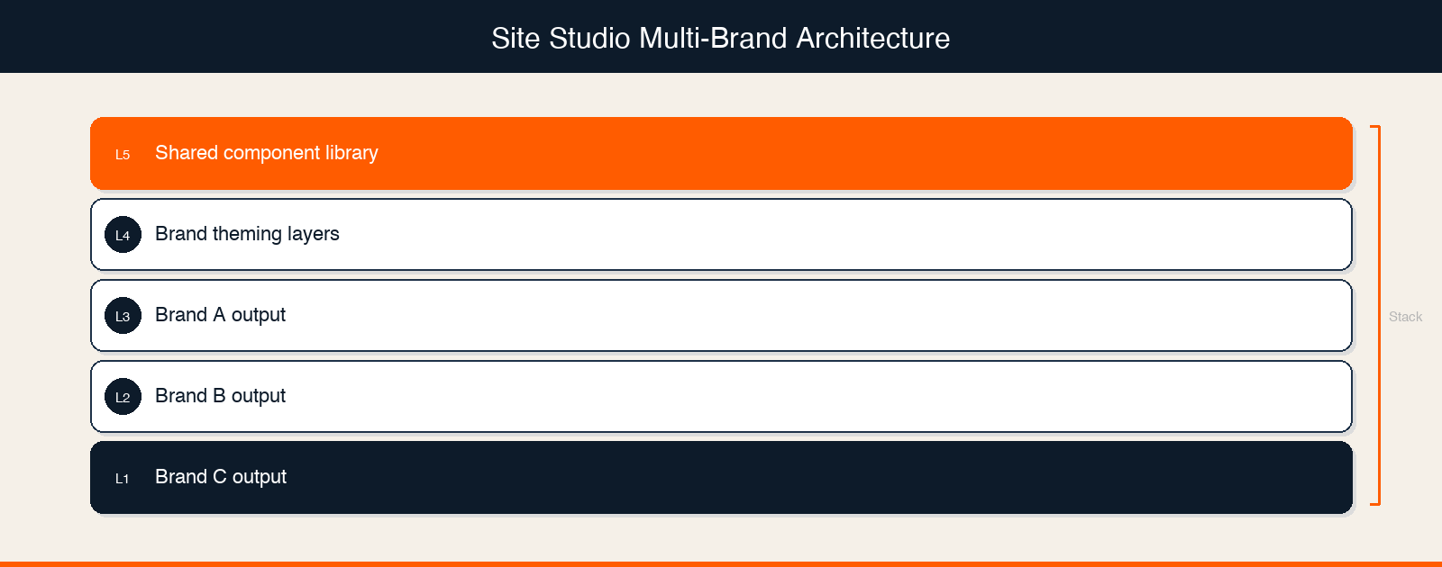
Drupal Site Studio (formerly Cohesion, now part of the Acquia ecosystem) is a low-code component builder that sits on top of Drupal's content architecture, allowing teams to define component structures, attach configurable style options, and deploy components across multiple brand sites from a single library.
The team selected Site Studio for this multi-brand engagement. Based on Site Studio's documented platform capabilities, three characteristics are relevant to multi-brand use cases.
Structure and theming separation. Site Studio's architecture allows component structure (layout, content fields, responsive behavior) to be defined independently from visual styling. In principle, this means a single component definition can render differently across brand properties based on applied styles. Note: How the team implemented this separation in practice, including whether they used Site Studio's style tab configurations, CSS custom properties, or another theming mechanism, is detail we do not yet have from the technical team.
Consistent editor interface. Site Studio's component-based authoring means editors across brand properties interact with the same component placement and configuration interface regardless of which brand they are editing. The visual output differs by brand. The editing experience does not.
Centralized component updates. When a component in the shared Site Studio library is updated, the change propagates across all brand properties that use it — eliminating the need to apply the same fix independently to each brand's codebase. This centralizes maintenance rather than requiring the same fix to be applied independently on each brand's codebase.
For teams evaluating Drupal's ecosystem for multi-site management, the case for Acquia MEO as a multi-site Drupal management approach is also worth reviewing alongside Site Studio's component capabilities.
What We Know About The Component Library
The team built a reusable component library that includes five documented component types: Hero Banners, Content Cards, CTA buttons, sliders, and video components.
These five types were designed to ensure consistency across all three brand properties while allowing for brand-level customizations. That is the extent of what is documented in project records.
What we do not yet know, and what would make this story significantly more useful to practitioners:
| Known (Documented) | Unknown (Needs Technical Team Input) |
|---|---|
| 5 component types: Hero Banners, Content Cards, CTAs, sliders, video | Total number of components in the library |
| Platform: Drupal with Site Studio | How brand-level theming was implemented technically (CSS variables, Site Studio style configurations, token systems, or another approach) |
| Goal: consistency across 3 brands with brand-level customization | Which components could be fully shared versus which required brand-specific variants |
| Structured discovery phase preceded development | What the discovery phase revealed about content pattern overlap across brands |
| Discovery question sheet and understanding document were created | What decisions those documents drove about component scope and shared versus bespoke boundaries |
This gap is worth being direct about. The architectural approach is sound in principle. Site Studio is a credible tool for this use case. But the implementation specifics that would let another team replicate this approach require input from the technical team that is not yet captured. Our Drupal development services practice has handled similar multi-brand architecture decisions across a range of platforms and client contexts.
The Core Architectural Question: What Gets Shared Versus What Gets Themed
The fundamental decision in any shared component library is where to draw the line between structure (shared) and presentation (brand-specific). In a well-designed multi-brand Drupal component system, structure governs layout, information hierarchy, and accessibility — while presentation governs color, typography, and visual identity — and these two concerns must be cleanly separable at the component level.
Some distinctions are obvious. The placement of a CTA button within a Hero Banner is structural. It affects information hierarchy, user flow, and accessibility. The button's color is presentation. Different brand, different color, same component.
Other distinctions are genuinely hard. Is a Hero Banner's height structural (it affects content density and scroll behavior for all brands) or brand-specific (one brand wants immersive full-viewport heroes, another wants compact headers)? Is a Content Card's image-to-text ratio a layout decision or a brand voice decision?
These questions do not have universal answers. They depend on how much visual divergence the brands actually require and how much complexity the team is willing to manage in the theming layer.
Three Technical Approaches To Structure-Presentation Separation In Site Studio
Based on Site Studio's capabilities, there are several possible approaches to managing this separation:
Style tab configurations. Site Studio allows component builders to define which style properties are configurable per instance or per context. A team could expose height, spacing, and color as configurable while locking layout structure.
CSS custom properties (design tokens). Brand-specific values (colors, font families, spacing scales) can be stored as CSS custom properties and swapped per brand context. The component references the token. The token resolves to brand-specific values.
Separate style packages per brand. Site Studio supports applying different style configurations to the same component structure. Each brand gets its own style package while inheriting the shared component definition.
Note: We do not yet know which of these approaches the team used, or whether they combined multiple approaches. This is one of the key questions for the technical team interview.
Teams navigating similar modular decisions in frontend architecture may also find value in reviewing how modular frontend architecture accelerates enterprise UX — the principles for component isolation map closely to the Site Studio use case.
Discovery Before Development: Why Scope Alignment Precedes Component Build
Before any component was built, the team ran a structured discovery phase. On multi-brand platform builds, a structured discovery phase that maps content pattern overlap across brand properties before development begins is what determines whether a shared component library is actually viable — or whether the brands are too visually divergent for meaningful reuse.
The project records confirm that the team created a discovery question sheet and an understanding document. These were used for internal discussions to align on scope before development began.
One operational detail stands out. Before the engagement formally kicked off, the delivery lead initiated pre-kickoff sync sessions with the core team. This happened because key team members had planned time off approaching, and the lead wanted shared understanding of scope and roles established before anyone went offline. On a project where early architecture decisions shape the cost structure of the entire engagement, that proactive alignment reduced the risk of starting development without full team context.
The specific findings from the discovery phase, including what the team learned about content pattern overlap across the three brands and how those findings shaped component scope decisions, are not yet documented in a form we can share. For a deeper look at how discovery phases are structured for complex digital engagements, see our post on why we run three discovery tracks in parallel.
What A Shared Component Architecture Is Designed To Enable
The architectural reasoning behind a shared component library targets three outcomes. These are the intended benefits of the approach, not measured results from this engagement.
Reduced development scope for subsequent brand properties. If the component library is well-designed, standing up the second and third brand properties should require theming and content work rather than component development. The components are already built. The work shifts to brand expression, not structural construction.
Centralized quality and consistency. A single governed component library means accessibility improvements, performance optimizations, and UX refinements made to a shared component benefit all brand properties simultaneously — rather than being applied manually across independent codebases. Bug fixes and accessibility improvements applied to a shared component benefit all brand properties simultaneously.
Reduced editor training overhead. When the authoring interface is consistent across brand properties, editors working across brands do not need to learn different component systems. The visual output differs. The authoring experience does not.
For organizations considering a broader digital experience platform strategy, a well-governed component library is often a foundational capability — enabling personalization, A/B testing, and cross-brand analytics on top of a consistent structural layer.
Evaluating Whether This Architecture Is Right For Your Platform
A shared component library is not the right answer for every multi-brand situation. The architectural case for shared components strengthens when certain conditions are present and weakens when others dominate.
When Shared Component Architecture Makes Sense
High content pattern overlap across brands. If the brands genuinely share the same UI patterns (hero, card, CTA, media) and differ primarily in visual identity rather than structural layout, the shared library can capture most of the development work.
Centralized development team. A shared library requires governance. If development is centralized (one team owns the library), governance is tractable. If development is distributed across brand-specific teams, the library will fragment.
Planned brand growth. The shared component investment pays off over time and across brands. If the organization is planning to add more brand properties, the amortization math improves with each addition. Organizations navigating multi-brand digital estate decisions may also find the HubSpot-centered architecture case for a multi-brand industrial group useful as a parallel decision framework.
When Shared Component Architecture Breaks Down
High structural divergence across brands. If each brand requires fundamentally different layout patterns — not just different colors but different information hierarchies — the shared structure will need so many variants that the library becomes difficult to govern.
No governance owner. A component library without a governance owner drifts. Teams add brand-specific variants, exceptions accumulate, and the library eventually becomes as fragmented as the bespoke approach it replaced.
Platform limitations. Not every CMS supports clean structure-presentation separation. Drupal with Site Studio is one credible option. Not every organization is on Drupal, and not every Drupal implementation has Site Studio configured for multi-brand use.
If your team is assessing Drupal's fit for a multi-brand platform, our Drupal development services team works through exactly these architecture questions — and our post on how to scope a fragmented digital estate without getting it wrong covers the pre-architecture assessment that should precede any platform decision.
Frequently Asked Questions
What is a reusable component library in Drupal Site Studio?
A reusable component library in Drupal Site Studio is a centrally governed set of UI components — such as Hero Banners, Content Cards, CTAs, and sliders — built once in Site Studio and deployed across multiple brand sites. Each brand can apply its own visual theming (colors, typography, spacing) while inheriting the shared component structure, eliminating the need to rebuild common patterns for each new brand property.
How does Drupal Site Studio handle multi-brand theming?
Drupal Site Studio separates component structure from visual presentation, allowing the same component definition to render differently across brand contexts. Teams can implement multi-brand theming through Site Studio's style tab configurations, CSS custom properties (design tokens), or brand-specific style packages — each approach keeps structural logic shared while swapping visual identity per brand.
When should a multi-brand organization use a shared component library instead of separate codebases?
A shared component library is most valuable when brands share the same UI patterns but differ in visual identity, when a centralized team can own component governance, and when the organization plans to add more brand properties over time. If brands require fundamentally different layout structures or development is highly distributed, independent codebases may be easier to manage than a fragmented shared library.
What is the governance risk of a shared Drupal component library?
The primary governance risk is library fragmentation: without a designated owner, teams add brand-specific variants and exceptions until the shared library becomes as complex as multiple independent codebases. Effective governance requires a defined owner, a documented policy for when new components are added versus when existing components are extended, and a regular review cadence to retire or consolidate variants.
How does Site Studio compare to building a custom Drupal component system?
Site Studio provides a low-code authoring layer on top of Drupal's content architecture, allowing teams to define and manage components without custom module development for each UI pattern. A custom Drupal component system offers more flexibility but requires higher engineering investment and ongoing maintenance. For multi-brand platforms where editor experience consistency is a priority, Site Studio reduces the authoring complexity that a fully custom system would create.

Hardik Kumar Patel, Senior Software Engineer
Hardik is a big fan of sports and video games. Away from work, he spends time with his son, works out at the gym, hangs out with friends, and plays cricket. Bring PUBG, PS4, or Call of Duty in your conversation, and he’ll be all ears.

Leave us a comment